

Data visualization is a powerful technique that businesses and consumers use to make sense of the world around them. With the help of visualization techniques, stakeholders are able to make smarter decisions and maintain confidence in those decisions. Data can be represented in a number of different ways, and data scientists utilize a vast network of different visualization tools to help give decision-makers and others the full picture that they need to make intelligent decisions in all realms.
A bubble graph is a great example of a unique visualization tool. Bubble charts, also known as bubble graphs and bubble plots, are used when data requires a third dimension to make sense of the information for viewers. Bubble charts offer a relational view that is designed specifically to compare three variables rather than two, as in visualization tools like a line chart or bar graph. One thing that sets a bubble graph apart is the use of relational size as the third axis, rather than a traditional z-axis that extends outward toward the viewer to create a three-dimensional field of plotted points or other data representation options.
This and other data visualization tools offer users a better experience overall and a richer environment in which to make decisions. Whether you are using visualizations in business, your personal life, or anywhere else, the power of these tools for making sense of the world around us is undeniable. Continue reading to learn more about data visualization tools and why they are so useful in so many different settings.
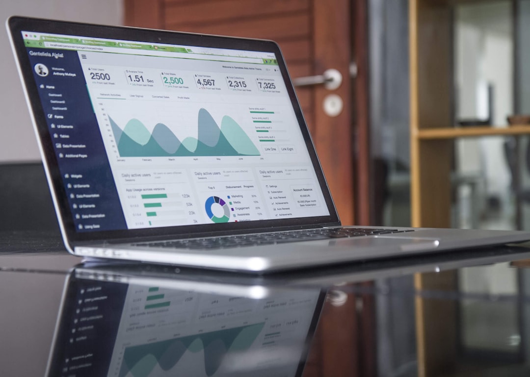
Many businesses incorporate data visualization as an automated process.

Business intelligence relies on great insights. In order to facilitate good decision-making at all levels of business, brands must rely on automated data extraction, analysis tools, and of course, visualizations. The use of data visualization tools has a long history in the world of business, however, there are constant improvements that are being made to the quality and type of tools that can be used in this realm.
Indeed, many brands now incorporate automated systems and monitoring solutions that allow for integrated data products to collate information and produce automated visualizations that can be consumed for immediate understanding and decision-making processes. The use of automated systems has transformed the way businesses operate at all levels. With the help of cloud-based technologies, automation has become the norm in this space, and many brands are competing with greater ferocity than ever before. As a result, virtually all businesses require the use of data-based analysis in today’s world in order to keep up with the pace of consumer demands and the business market itself.
Data visualization is great for the consumer space as well.
In addition to business utility, data visualization holds an important space in the consumer marketplace as well. Homeowners, renters, and all other consumers rely on visualization tools to make sense of their budgets and daily tasks on a routine basis. In its most basic sense, visualization offers an image-based understanding of the question at hand. With the help of tools like pie charts, bar graphs, line graphs, and other options in this space, consumers are able to see where their money is going, how their investments are performing, and many other aspects of their time, finances, and other daily needs.
While many consumers won’t utilize the same level of automation in this arena, applications and software packages have brought these same elements to the consumer marketplace, allowing everyday members of society to consume data in ways that are similar to the typical business user.
Consider bringing data visualization tools into your ongoing processes today for a unique boost to your productivity.